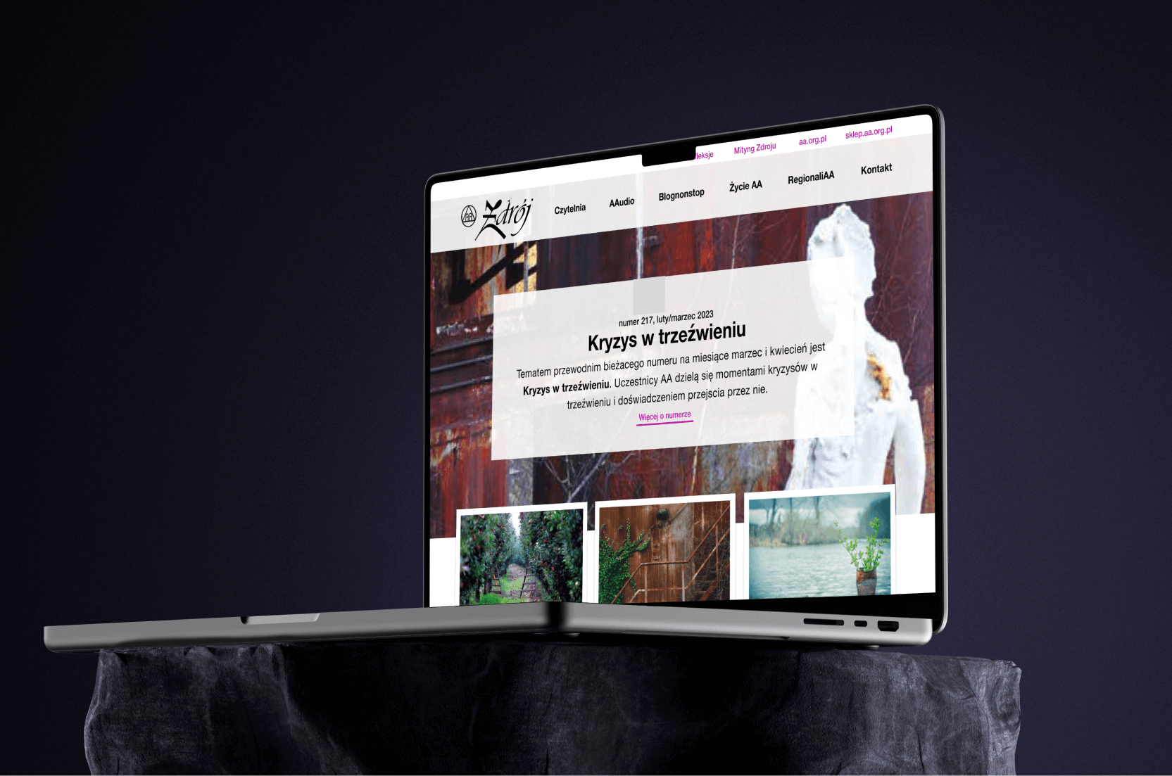
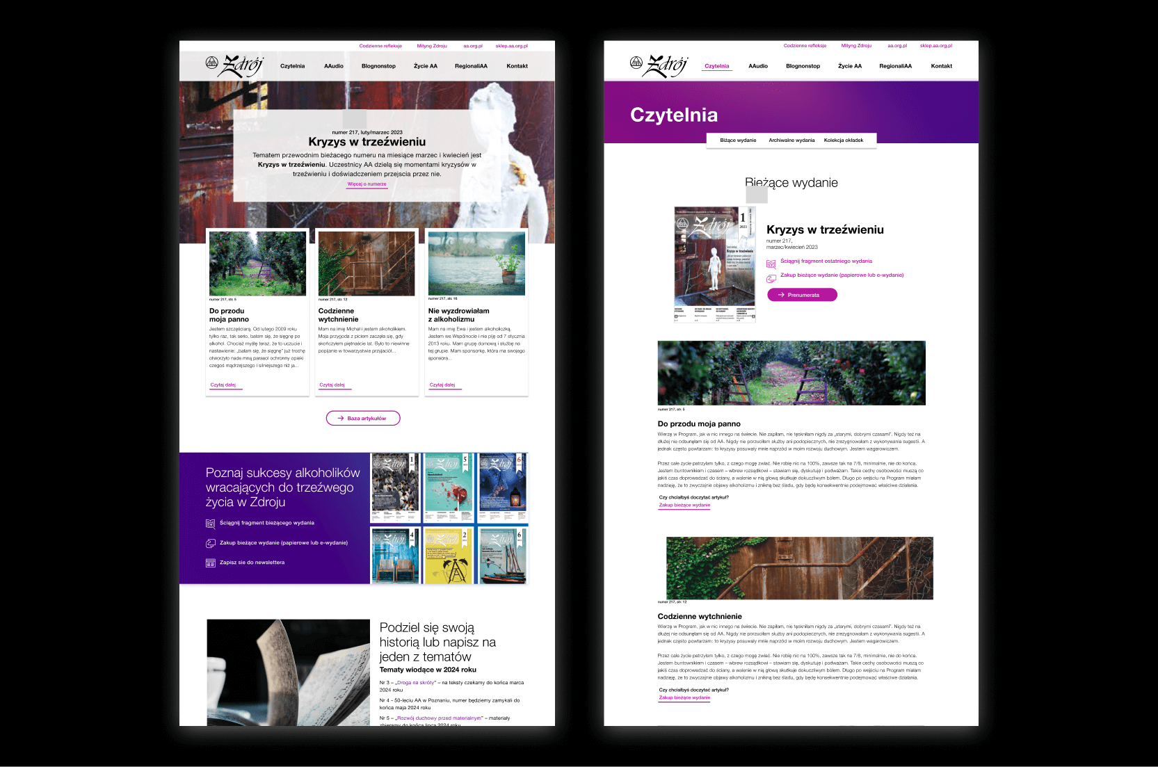
Magazine Portal Redesign
I was tasked with redesigning a magazine website for an AA Fellowship in Poland. The goal was to improve the user experience and organization of the site, which serves as a vital resource for individuals seeking support in their journey through the 12-step program. The existing site lacked structure and needed a comprehensive overhaul to better serve its users.
To address these issues, I conducted surveys and user interviews, and researched basic analytics to gather insights into user needs and behaviors. Based on this data, I created wireframes and prototypes, and developed a new site architecture that drastically reorganized the existing content and added new sections. Although the project is not yet completed, the preliminary feedback from stakeholders has been positive, indicating that the new design will significantly enhance usability and engagement once fully implemented.

